Craft
·
·
BY
Lucy Marks
Notes from the press in Long Island City
We stand next to the press for every first run. A producer’s account of why, and the three things that go wrong when nobody does.
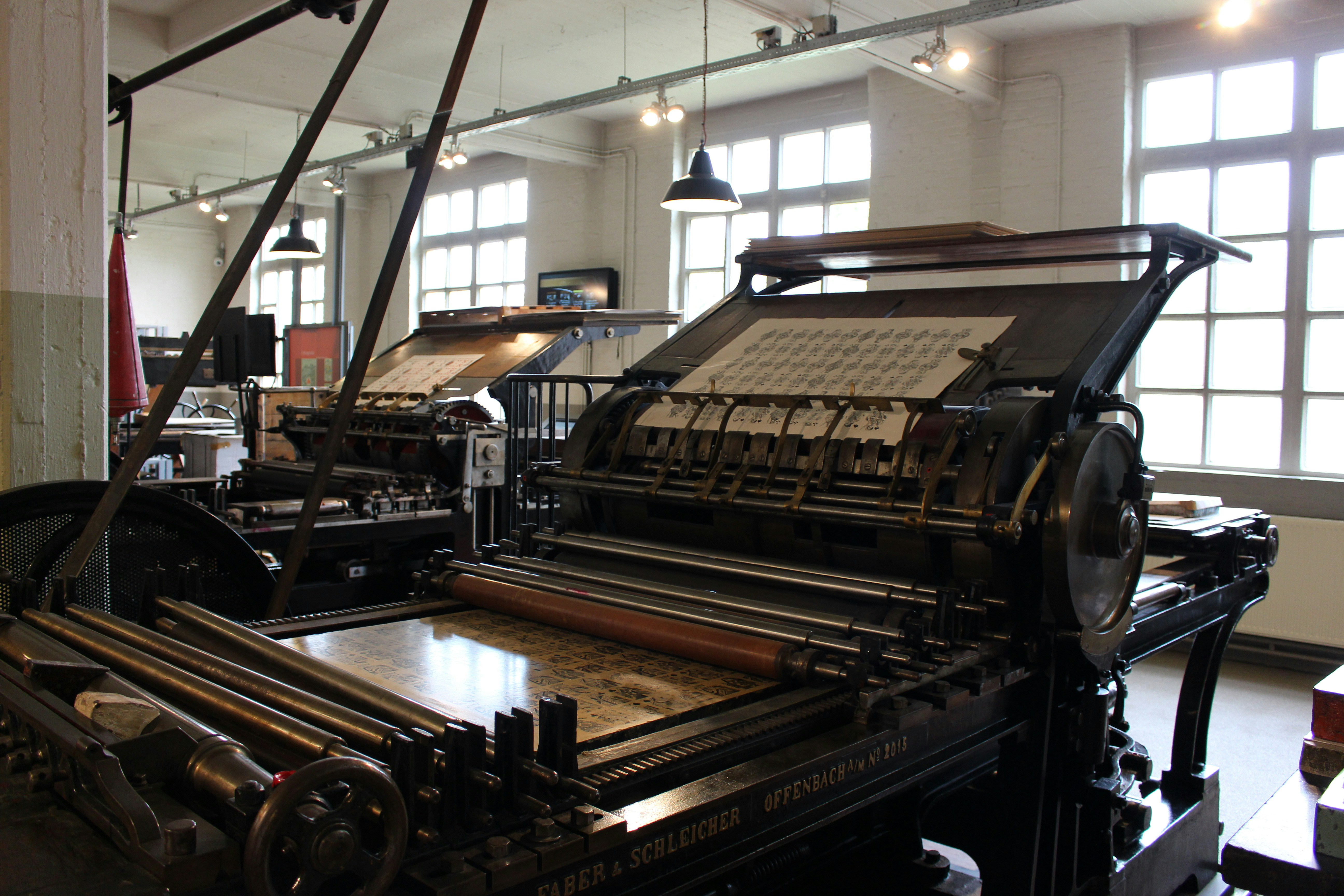
Every job that ends up on paper goes through one shop in Long Island City, and every first run has one of us standing next to the press. Clients occasionally ask whether that is really necessary. It is the least glamorous half-day in the project and it is the one that saves the project most often.
The first thing that goes wrong is color. A brand green that was approved on a calibrated screen and a digital proof arrives on the sheet a shade cooler, because the stock is warmer than the proof paper. The pressman can pull it back in two passes if someone who knows the green is standing there. If nobody is, the green ships.
The second is the foil. Foil looks perfect on a mockup and lifts at the edge of a fine serif on the real die. We learned this on Hollow Oak and now every wordmark that will be foiled is drawn with the die in mind: slightly heavier hairlines, corners rounded by a hair. You cannot see the difference on screen. You can feel it on the bottle.
The third is the fold. A menu or a brand book that reads beautifully as a flat spread cracks on the spine when the stock is too heavy for the score. We ask for a folded blank in the real stock before we lay out a single page, and we keep a drawer of them in the studio for the next job.
None of this is exotic. A good printer will catch most of it. But a good printer is running your job between two others, and the only person in the building who knows what the thing is supposed to look like is us. So we go, we bring coffee, and we stay until the sheet is right.
If you are a client reading this: the press day is on the schedule and you are welcome at it. Most people who come once come every time.