Payl

A New York fintech with a good product, a deck full of gradients and three weeks to a Series A.
Payl moves money between small businesses. The category is loud, purple and interchangeable. Nothing about the old brand said the product was calm to use.
What we did
We built a system out of one typeface, one accent and a table. Numbers are tabular everywhere — deck, product, site — so a statement reads like a statement.
The UI kit shipped with the brand book, which is why the Series A deck used the system unchanged.
$12M
SERIES A CLOSED 3 WEEKS AFTER LAUNCH
TEAM
Claire Simmons, Mark Voss, Jonah Pell
PHOTOGRAPHY
Jake Sutton
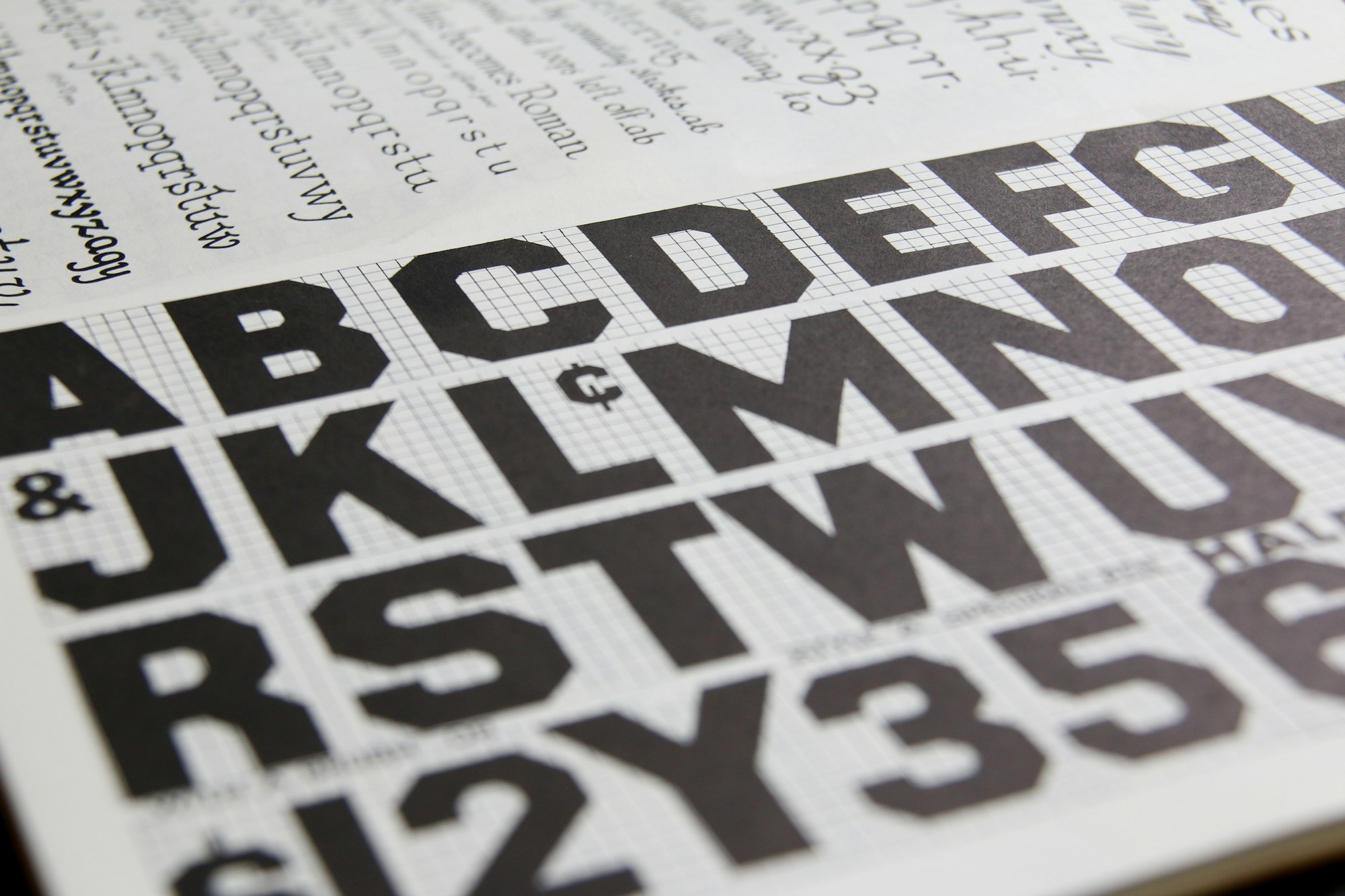
TYPE AND NUMBER SYSTEM, TABULAR THROUGHOUT


THE PRINTED SYSTEM: CARDS, ENVELOPES, CHIPS
$12M
SERIES A, THREE WEEKS AFTER LAUNCH
1 kit
BRAND + PRODUCT, ONE SYSTEM
9 wks
STRATEGY TO LAUNCH
Our Series A deck used their brand system unchanged. Investors noticed.
ANNA BRENNAN, CEO
