
Roots Festival
Posters that moved before the bands did.
A three-day music festival that had changed its poster style every year for a decade.
Roots had no visual memory. Every year a new designer, a new logo, a new argument about the line-up hierarchy.
What we did
One rule: the line-up is the artwork. Names are set in a single face, sized by stage time, and the poster is whatever shape that makes. It scales from a subway card to a building.
The motion kit animates the same grid, so social, screens and the stage backdrop are one thing.
92%
Tickets sold before the line-up closed
Team
Emma Pearce, Mark Voss, Bea Newman
Photography
Andrew Vance

Poster wall, Red Hook


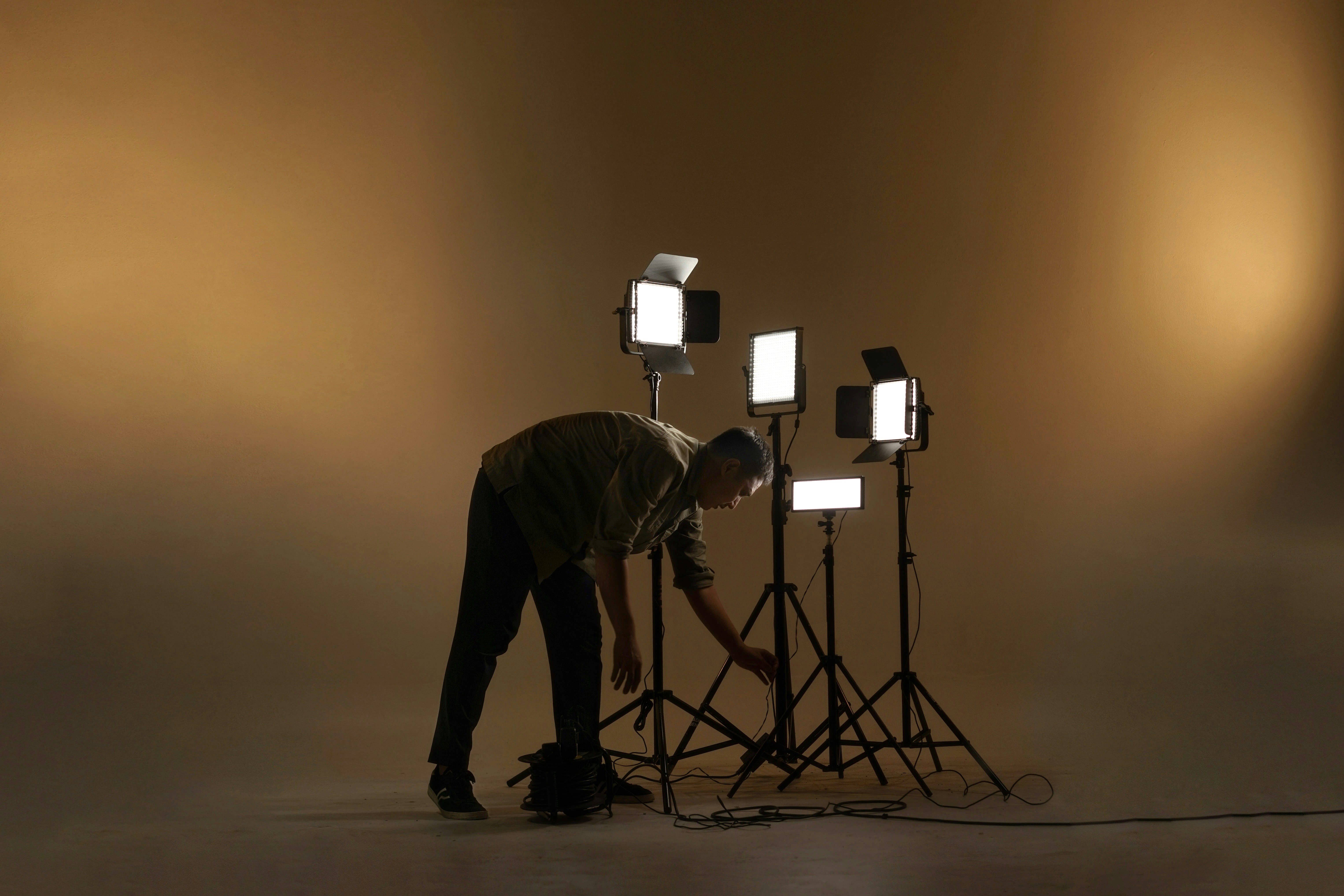
The light rig, first night
92%
Sold before the line-up closed
1 face
The whole campaign
3 days
64 artists, 4 stages
For the first time the poster looked like us and not like the designer.
Luke Nolan, festival director
